Available for new projects
A complete brand and product experience for an EV innovation company pushing the boundaries of sustainable transportation.

MCKM approached us at a pivotal moment. They had groundbreaking EV technology and ambitious plans to disrupt the electric mobility market but no brand identity, no digital presence, and no product interface to showcase their innovation.
The challenge wasn't just designing a logo or website. It was creating a complete brand ecosystem that could communicate complex technology simply, appeal to both B2B partners and end consumers, and position MCKM as a serious player in a space dominated by established automotive giants.
We needed to build trust, demonstrate innovation, and create a visual language that felt as forward-thinking as their technology.
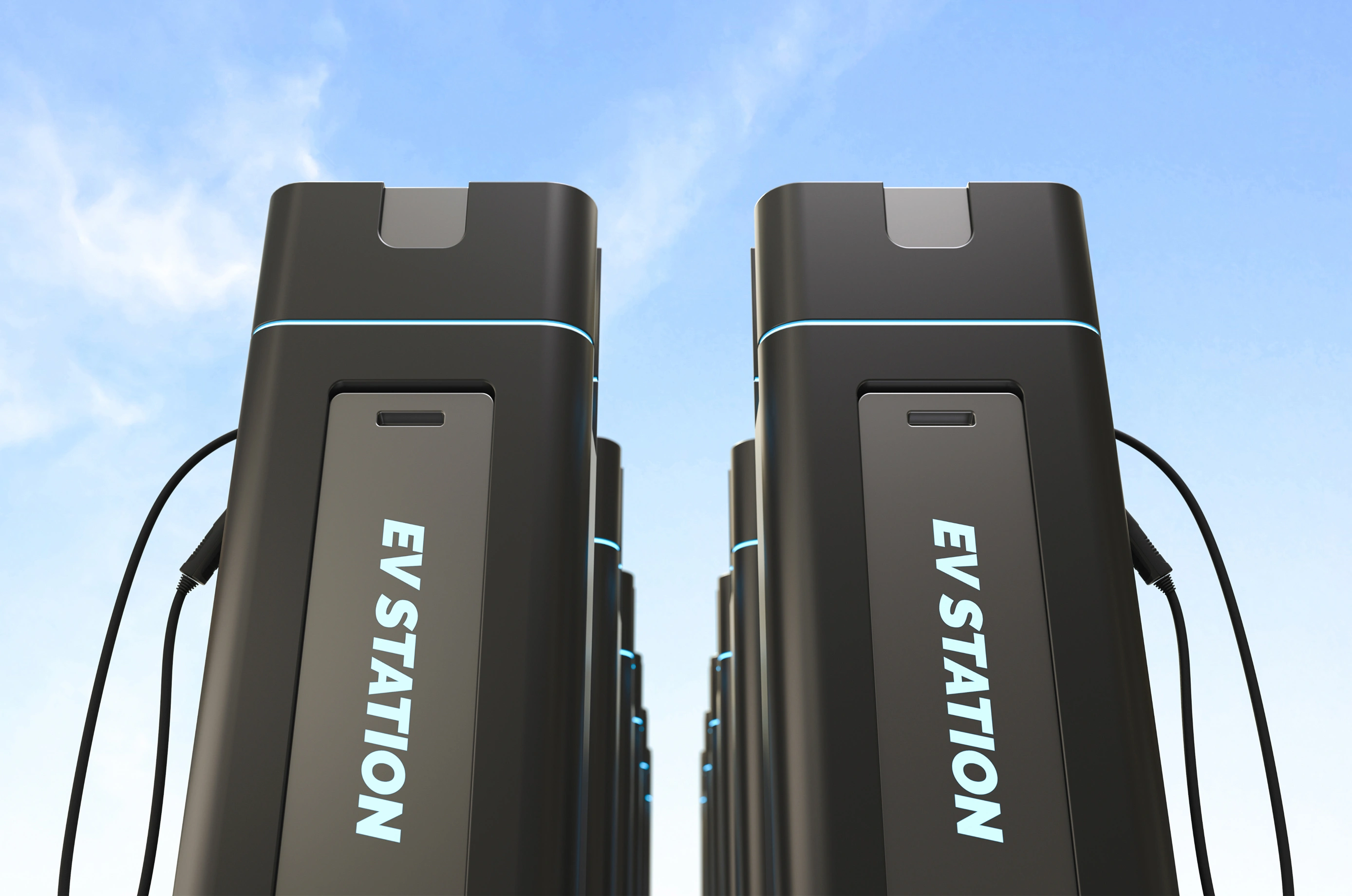
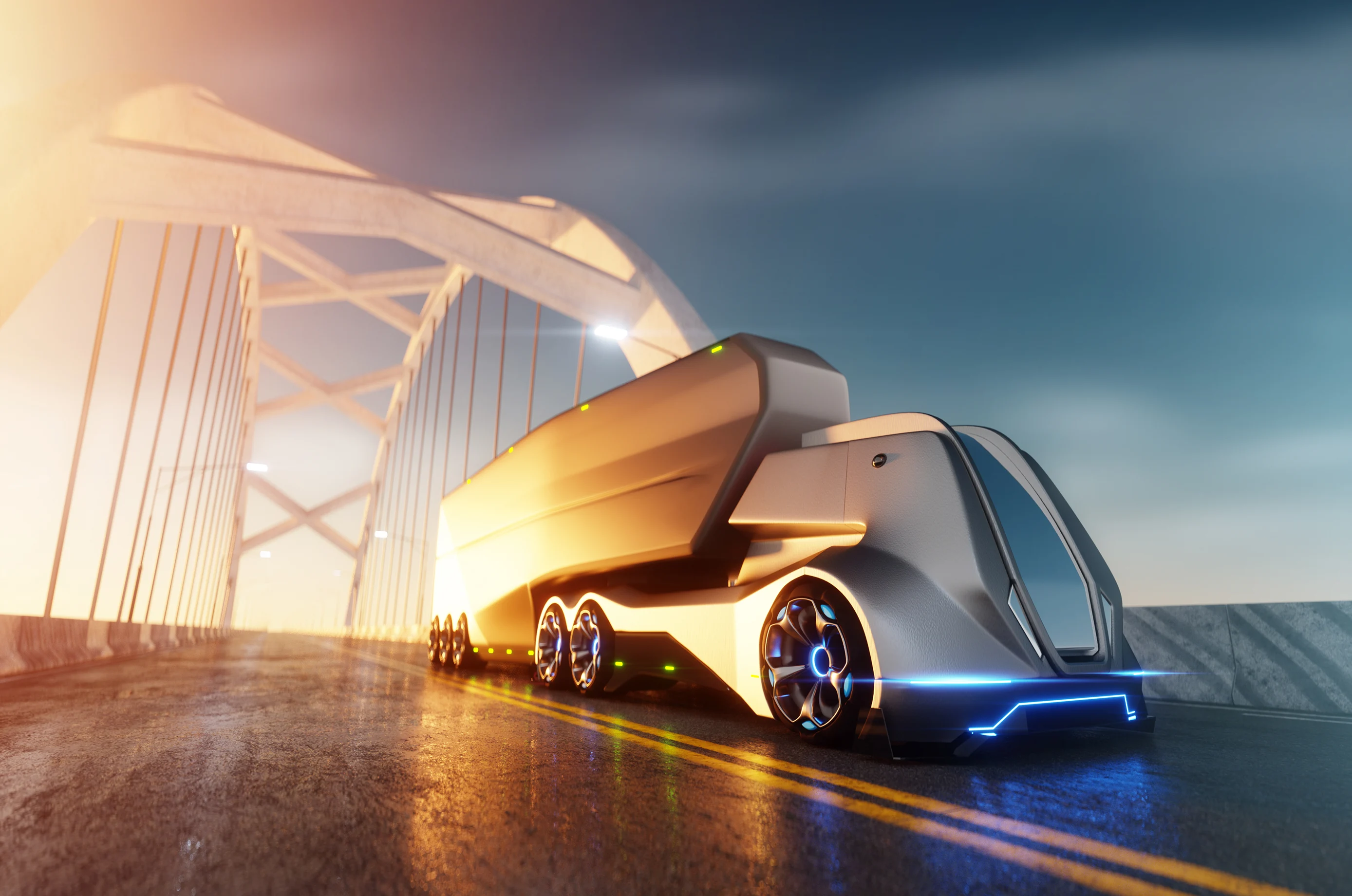
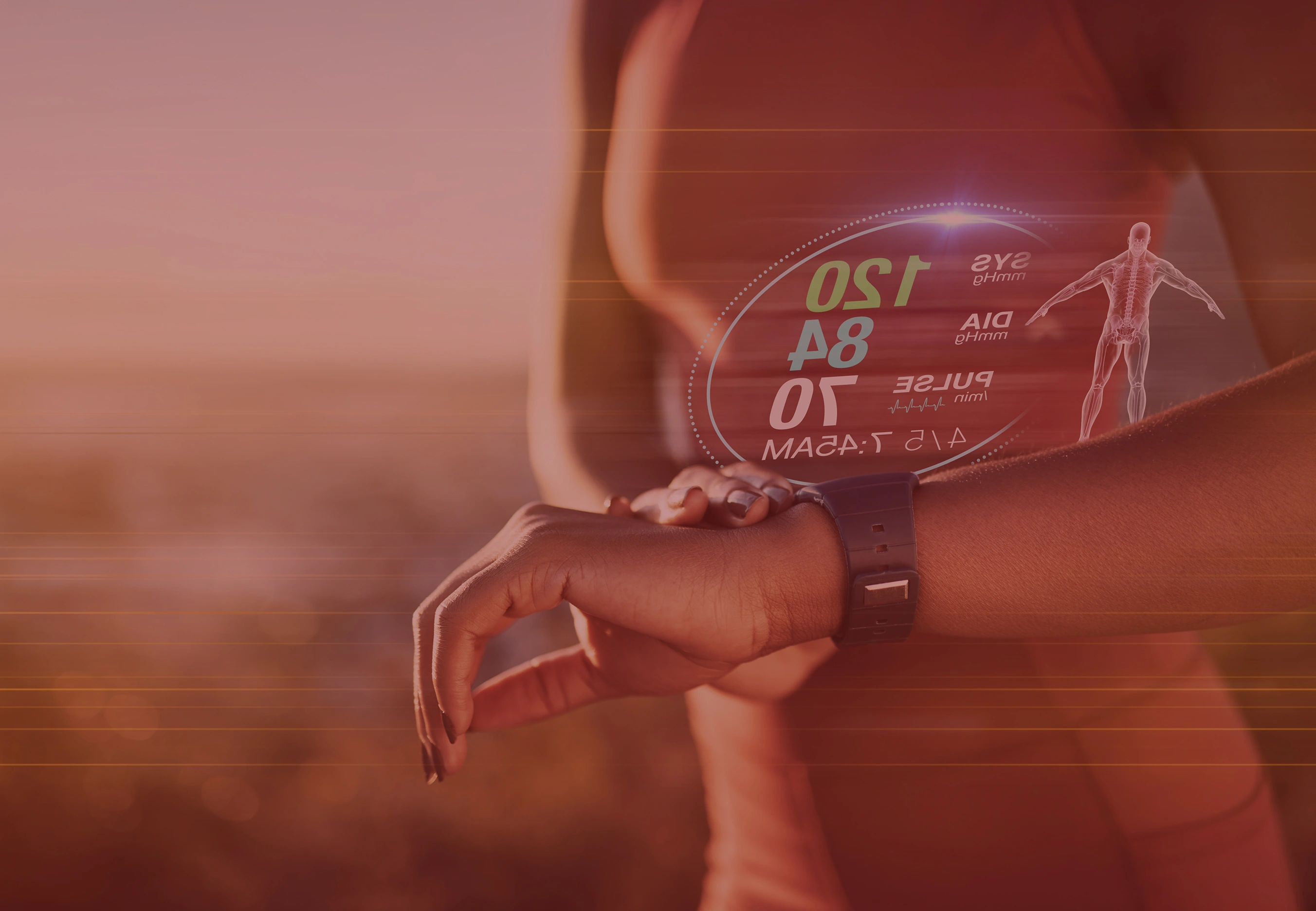
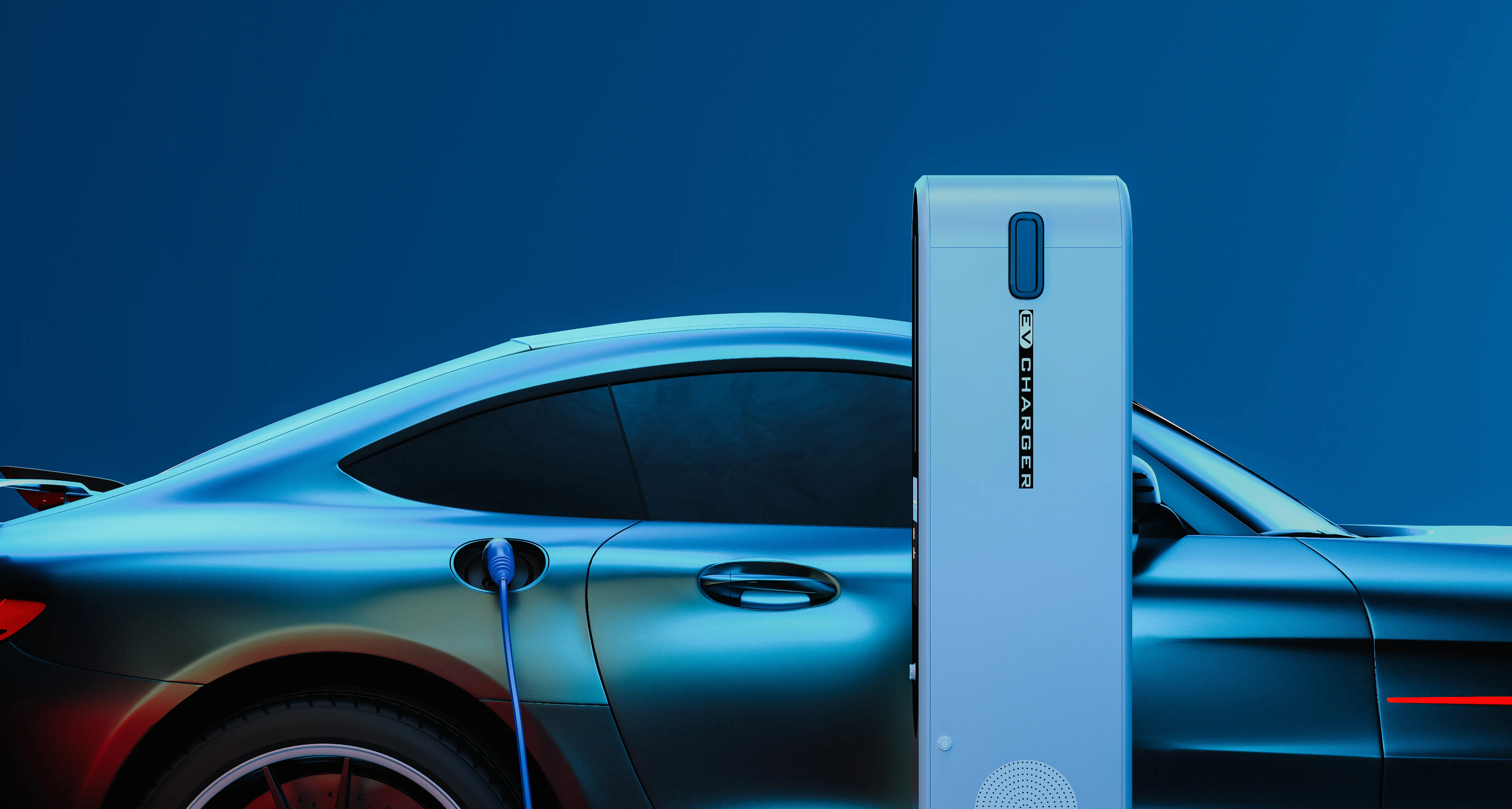
MCKM is an electric vehicle innovation company developing advanced battery management systems, intelligent charging solutions, and integrated mobility platforms. Their technology enables faster charging, longer range, and smarter energy management for next-generation EVs.
Founded by automotive engineers and software developers, MCKM combines deep hardware expertise with modern software thinking building the infrastructure layer that makes electric mobility truly sustainable and accessible.
Target Audience:
We explored 15+ logo concepts across three distinct directions before landing on the final MCKM mark. Early explorations included literal EV imagery (lightning bolts, charging ports) but we moved toward abstract geometry that felt more timeless and premium.
Rejected Directions:
Final Direction: Sharp, modular letterforms with subtle connectivity between characters — suggesting integrated systems and seamless technology.
Thoughtful work, process insights, and studio updates - shared occasionally, only when there’s something worth saying.